You want command of your copy. I’m a versatile and accomplished senior copywriter and editor with a passion for serving both the reader and the intentions of your business.
I have more than ten years as a remote work specialist with continual success, and over 200 international team awards to show for it. If it has to do with words — from books and blogs to socials, campaigns, and newsletters — I’ve most likely accomplished it with a stellar team such as yours.
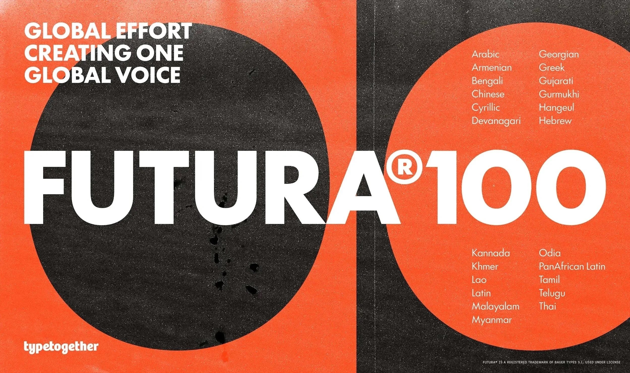
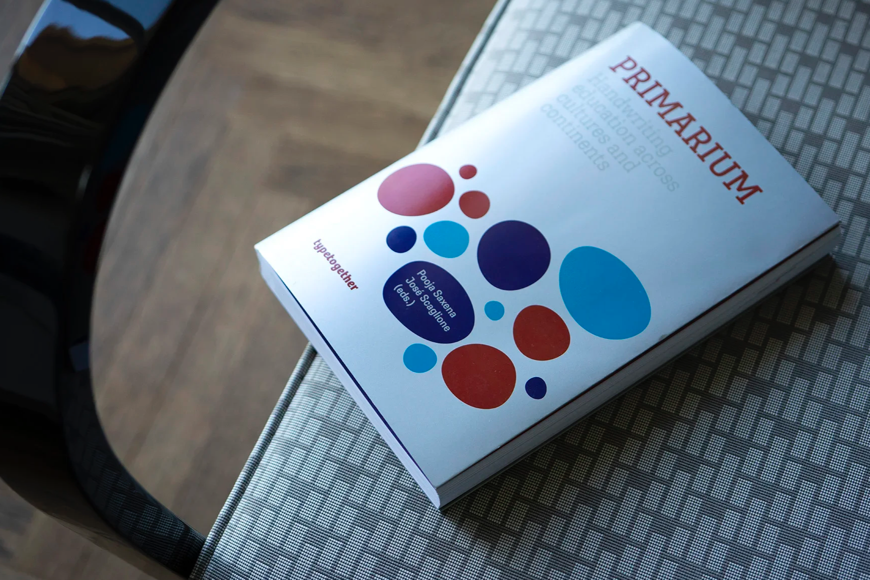
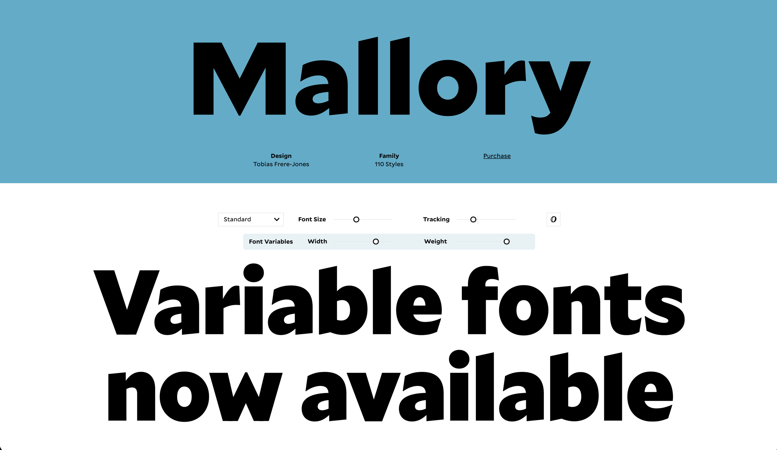
Whether creating copy or refining what you’ve already begun, I’m happy to bring my expertise to your projects where my experience will map well to your goals. Find out more here.
Futura®100 font family, TypeTogether & Bauer Types
The story
The classic geometric family — redesigned for modern tools, faithfulness to the original’s warmth, and for global multiscript use.
After two years of extensive research to accurately honor Paul Renner’s intention, the renowned geometric typeface is now available for worldwide use.
The results
Designed in 23 scripts for multinational branding, digital devices, and modern publishing demands, this is the first worldwide design of Futura to create harmony across each script.
Awarded the 2026 Tokyo TDC Grand Prix, the top award available for outstanding work
Print Magazine article, 2026 Type Report
Print Magazine article, Futura’s Global Expansion by TypeTogether Fit for Another 100 Years
My role
All text: descriptions, socials, newsletters, campaign slogans.
Blog articles: coming soon, new release, corporate appeal, cross-linking.
One line, one paragraph, and one page description.
Text defines campaign, all posts, and video.
Comedy Central custom type article, Type Network
The story
“Branding the funny: Defining Comedy Central’s brand through type.”
Branding is both an art and a science. It’s also a business aimed at winning over fans — those people who keep coming back for more. Comedy Central has been successfully bringing fans back for 40 years as the top all-comedy network.
The results
This article explores Comedy Central’s typography rebrand, focusing on Type Network’s capabilities and reinforcing them as the go-to type designers for known brands. Now, with the branding experience of loyalkaspar and the type design expertise of Kerns & Cairns for Type Network, Comedy Central has amplified its voice across platforms and a changing media landscape.
My role
Blog article text.
Letters for the Future: Ten Years of the Gerard Unger Scholarship
The story
The Gerard Unger Scholarship is a mentorship program recognizing the current skill and future promise of new typeface designers — it is fuel to the creative fires already burning.
Named after one of the alchemists and godfathers of type design, Dr. Gerard Unger (1942–2018), the scholarship celebrates the melding of creativity and functionality. This book maps ten years of the Gerard Unger Scholarship, which was founded to help young type designers complete and publish their typefaces professionally. It provides a comprehensive history of the scholarship, introduces the typefaces produced thus far, and features interviews with the scholarship recipients.
The results
The book shows how a positive outlook can impact an entire design category, raising its overall value globally, and setting the bar for future design work primarily committed to serving and benefitting others. It recognizes the value of progressing together toward an interconnected and cosmopolitan future driven by fearless innovation, deep research, aesthetic beauty, and steadfast goodwill.
My role
Copy editor, introduction and back cover text writer.
Merchandise descriptions, socials, newsletter, campaign slogans.
Blog articles: coming soon, new release, cross-linking, BTS, video.
Text defines campaign and all posts.
Chaco font family, Rubén Fontana
The story
Identity meets bold performance: a sans with a classic soul and contemporary aesthetics.
Contemporary typefaces can often fail if they have no verve or historical foundation. This sans family has both, combined with excellent research and modern panache.
The results
Designers and other users can instantly upgrade their wayfinding, branding, and text choices with this contemporary solution. Additionally, while the Argentinian type designer, Rubén Fontana, is well known in his own country, this project has now rightly introduced him to the wider design world.
My role
All text: descriptions, socials, newsletters, campaign slogans.
Blog articles: coming soon, new release.
One line, one paragraph, and one page description.
Text defines campaign, all posts, and video.
Primarium: Handwriting Education Across Cultures and Continents
The story
Primarium comprehensively documents Latin-based handwriting education across 40 countries.
Based on extensive, groundbreaking research over several years, this volume reveals how local history, cultural factors, and educational reforms have shaped diverse handwriting models. It identifies common challenges faced by educators and summarizes key findings by examining entrenched misconceptions, modern policy changes, and global influences.
The results
While highlighting the scope, methodology, and significance of the project’s extensiveness, the first-of-its-kind Primarium research provides various insights for those seeking to preserve, adapt, and evolve handwriting instruction worldwide.
Gold at European Design Awards (ED-Awards)
Gold at Indigo Awards in Digital Design for Social change
Silver at Indigo Awards for website design
My role
Book text editor.
Merchandise descriptions, socials, newsletter, campaign slogans.
Blog articles: coming soon, new release, corporate appeal, cross-linking, BTS, video.
Text defines campaign and all posts.
Mallory font family, Tobias Frere-Jones
The story
The Mallory typeface began as a personal experiment in dual citizenship: part British and part American, and based upon a long relationship with mixed heritage and nuanced palettes. Through 110 weights and five widths, Mallory treats history and complex identity as a launchpad.
From the type designer of Gotham, Retina, and Interstate, the Mallory family is geometric but not strict, tempered by more relaxed gestures throughout the family. This typographic composite creates an organic texture, inviting without distracting. It sets paragraphs and headlines with equal confidence, and with its MicroPlus styles, Mallory can also set the smallest sizes on any screen or page.
Font pairing is an underappreciated dilemma, and one of Mallory’s greatest strengths is as a companion. While Mallory can easily play the lead role in any branding or text situation, its approachable tone also makes it the ideal partner for almost any other genre, from a soft oldstyle or high-contrast modern to a commanding slab or staccato blackletter.
Mallory carefully balances its British and American lineage. The British influence is visible in the formal precision of capitals like ‘C, G, S’ as well as the splayed leg of the ‘R’. American influences are revealed in the gestural lowercase, its vivid personality constrained within its smaller shapes.
Mallory offers two optical sizes: Standard and MicroPlus. The Standard size distributes its 80 fonts over five widths (Regular, Compact, Narrow, Condensed, XCondensed), each with eight roman and italic pairs. MicroPlus has three widths (Regular, Compact, Narrow) with five weights of roman and italic pairs for 30 total fonts. Both the Normal and Compact can both serve as the “center” of the family, each with a full range of weights to build a palette.
The results
With 110 total styles, Mallory is both a cosmopolitan catalyst and transatlantic headliner. This intensely personal work from Tobias Frere-Jones is a pillar of his catalog, is used as the text face across his website and other sites, and has been deployed by companies such as Papa John’s pizza.
My role
All text: description, socials, newsletter.
One line, one paragraph, and one page description.
Text defines campaign and all posts.
Building Ligatures: The Power of Type, TypeTogether
The story
In typography, a ligature is a connection — an unbreakable bond between parts that results in something new, useful, and evocative. Over the course of its 15 years in existence, the TypeTogether type foundry has built precisely that, both literally and figuratively.
In Building Ligatures: The Power of Type, TypeTogether’s cosmopolitan team of experts presents a cross-section of the knowledge, experience, and best practices in type design, typography, and graphic design.
The selected essays of the know-how section reflect not only on philosophical and ethical considerations, but also on practical and technological aspects of typographic life. Discussions range from font quality, digital typesetting, matchmaking and licensing, and multiscript typography to more fundamental questions, such as whether the world still needs new typefaces. The tributes in the fonts section present a glimpse of the foundry’s most beloved typefaces, and the contributors section introduces some of the most respected and influential experts in the typographic industry who happened to become TypeTogether’s colleagues and friends.
The results
This creative, witty, and eye-opening journey traverses continents, cultures, scripts, languages, new technologies, and above all — type and those who love it.
Print Magazine article, TypeTogether’s Building Ligatures is a Must-Read for Progressive Typography Fans
My role
Copy editor, introduction and back cover text writer.
Merchandise descriptions, socials, newsletter, campaign slogans.
Blog articles: coming soon, new release, BTS, video.
Text defines campaign and all posts.
Bely font family, TypeTogether
The story
A classy throwback text font family with a fearless and venturesome display.
Bely is Roxane Gataud’s venturesome text font family paired with a fearless display in the French style. Built upon classical proportions to capitalize on reading familiarity, Bely’s four text weights combine comfortable reading with an admirable texture. Bely Display pushes the logic of the text weights to their extreme, resulting in adventurous forms for unforgettable packaging and headlines.
The results
Besides being used across millions of websites, printed matter, and brands the world over (such as Instagram), Bely is one of the most awarded typefaces in recent years.
Étapes 2014 Diploma Issue
2014 “TransFormations” Exhibition in Centre Pompidou
2016 SOTA Catalyst Award
2017 TDC Award of Excellence in Type Design
My role
All text: descriptions, socials, newsletters, campaign slogans.
Blog articles: coming soon, new release.
One line, one paragraph, and one page description, which fed full campaign, posts, and video.
Text defines campaign and all posts.